 |
|
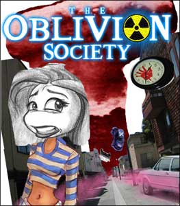
| Making the Cover A Look Into the Creative Process |
|
| I put this page together to
show a little bit about the collaborative process. More times than not,
projects have more than one person involved which makes it very much a give
and take. Typically, one person ultimately does have the final say but it
always fascinates me to see how inputs from differnt people affect the final
outcome. I like seeing the difference between a project when it starts and
when it is considered "done." I work with Marcus a lot on many different projects because we work well together. Even though this is his baby, he gives me lots of creative freedom and will listen to suggestion. He will aslo shoot down suggestions that are weak. In the end I think the result is a lot stronger than if it is just one person working alone. |
|
 |
|
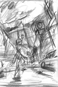 |
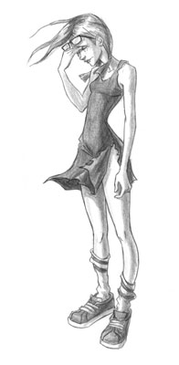
From the
collage I sketched out a rough drawing to work out the composition a little
more clearly. I suggested putting Vivian's whole body in to give a sense
that she's in the action rather than just standing in front of
it. I didn' want her to look like "the weather girl' showing us a
disaster on a screen behind her but to appear as someone who was in the
middle of danger. |
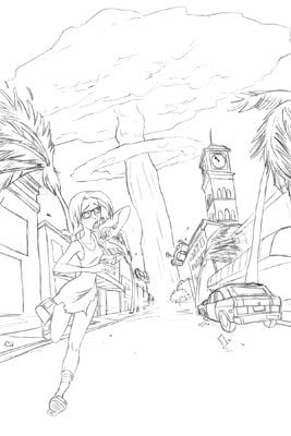 |
Marcus approved the rough so I did a more detailed drawing. Here's where I start fine tuning the compsotional elements and work out the pose and the details. |
 |
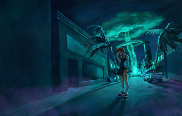
Here's the first color study. This is where color and lighting start coming into play. Since there is a giant explosion at the end of the street that was the obvious light source. And since were's dealing with fire, warm colors such as red, and oranges seemed logical. However... Sometimes logical isn't
the most interesting. And literal interpretations don't create
the right emotional vibe. So... |
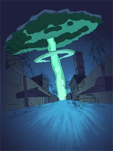 |
I revisted the color study. All the hot colors made the cover feel to me more like a Hollywoord movie poster or a comic book cover. Even though the research I did I did on nuclear explosions showed orange fiery mushrooms clouds, I wanted something that looked like chemical destruction and had more of a decaying, sickly feel. Greens and blues felt better. And since a lot of the Oblivion Society illustrations has greens and blues, this stayed true to the overall mood. |
| Then Marcus talked about revisitng
the pose. He said it felt a little awkward and I agreed. We tried a few
different running poses and then I had a suggestion: "What if she wasn't
running?" Any typical person would run from a nuclear explosion, but
the characters in this book are far from typical. It might be more effective
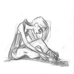
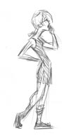
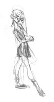
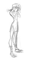
if the potential reader asks, why isn't this girl running? Since Vivian is a frustrated character we played with poses that showed her frustration and the posibility that this destruction isn't phasing her or that she just doesn't have the energy to fight destiny. Here are some roughs: |
||||
 |
 |
 |
 |
 |
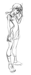 |
Marcus liked the last one but felt that maybe we shouldn't cover her face. So I did this one based on a photo that he took of his girlfriend. Photo reference is always good. It's one less thing you have to make up from your head Everyone was happy. |
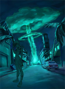 |
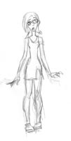
I had been working on the final background so we threw this sketch into the composition to see if it worked. Marcus thought it might be better if she had her back to the blast. Again I agreed. |
 |
So I did the final drawing of Vivian making sure she was facing the right way and that her hair and dress were blowing in the right direction. I was also careful to make sure her feet would in the same perpective as the ground. |
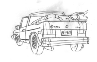 |
Then Marcus said, "Since we are fixing drawings, can you make the car a convertable - y'know, like in the book." I got no points for reading comprehension that day. I read the book but totally forgot it was a convertable. I was happy to fix it not only for the sake of continuity but also because the first drawing of the car wasn't very good. I'm not good at drawing cars and this still isn't a very good drawing of a car but it's better than the first. |
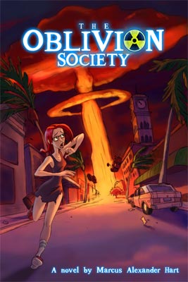
| From here I just had to paint it. Finally the elemts came together and we had a finished illustration. Originally the illustration was just going to be for the front but I went ahead and extended the composition to work as a wrap-around. That way, Marcus had the option to use it or not. It's better to have too much than too little. And it wasn't much trouble to extend the street to the left. Since text would go over the back it didn't need much detail: |
 |
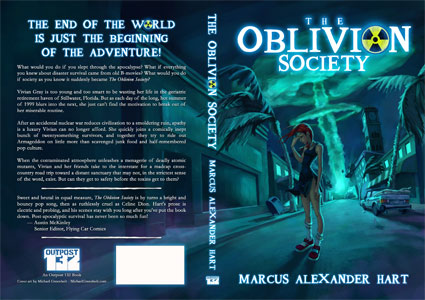
| Marcus added the text and cover is finished: |
 |
| Now if you'd like to see the cover in more detail, go buy the book. |
| The Oblivion Society and its characters © Marcus Alexander Hart. Visit the website and buy a copy HERE |
| © Michael Greenholt All Rights Reserved |